Cards
Cards are used to show user related data collectively, like product
details.
The card component can contain a variety of content, including a
heading, image, content and a footer.There are 7 variants of cards
here.
Simple Text Card
Simple Card is the one that contains a title, a descriptive text and footer. To use the simple card add the class name card-text to the wrapped div.
Card title
Vertical Card with Image
This is vertical card with image, card content and footer.
You can copy html part from below code snippet.
-
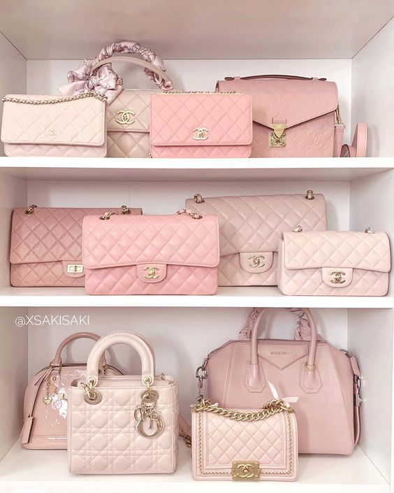
Stylish Bags
Girls White & Pink BagRs.3899 Rs.2999 10% Off -

Stylish Bags
Girls White & Pink BagRs.3899 Rs.2999 10% Off
Vertical Card with Badge
This is a variation of a vertical card, with badge. You can copy html part from below code snippet.
-
 New
NewStylish Bags
Girls White & Pink BagRs.3899 Rs.2999 10% Off
Vertical Card with Dismiss
This is a variation of a vertical card, with dismiss.
You can copy html part from below code snippet.

Stylish Bags
Girls White & Pink Bag
Horizontal Card
This is a horizontal card with image, badge and dismiss.
You can copy html part from below code snippet.

Stylish Bags
Girls White & Pink Bag
Card with Text Overlay
This is a card with text overlay.
You can copy html part from below code snippet.
Card with Shadow
This is a card with shadow.
You can copy html part from below code snippet.
Card title